Approachability and potential of customization are important parts of a user interface. GNOME feels weaker now in this department as compared to other desktop environments.
Fedora (12 I guess) was my first Linux distro. I didn't use Linux based stuff much back then but the change from the Luna theme of XP to GNOME 2 felt nice.
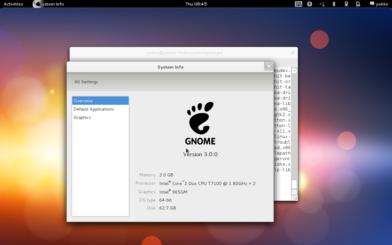
When they released lovelock (F15), they added GNOME 3. And needless to say, it was pure eye candy. Personally, I find the grid (of icons) based menu much easier to scan with my eyes and so I loved GNOME 3.

In spite of what popular opinions say about GNOME 3, I believe, drastic changes in UI help frame the next generation of design process. It has happened with Windows 7 (with Vista's aero theme) and hopefully will happen with Windows 10 (8's metro stuff).
After few years, I got inclined to use Linux as my full time OS, and then it all began, starting from Ubuntu.
Whenever I try to make my thoughts flexible about things like respecting others opinion, first thing I say to myself is "Ubuntu is also good, don't make a biased opinion".
But I never got over it. Ubuntu has never worked on my machine for more than ~15 days (even Arch was stabler). So, I never got my hands on unity much. Then came Mint, but you can't just get off your genes, and crash cycles again set in. After this I just kept hopping over and over,
- Fedora
- Arch
- FreeBSD (yes!)
- DragonFlyBSD
- Sabayon
- Manjaro
- . . .
- Random OS#n.
In those days, there was hardly an OS in top 20 on Distrowatch that I hadn't used. I knew there were solutions to the crashes, but it was fun. I got to use a lot of OSes. Once I thought to use Gentoo, (for those who don't know, the whole OS gets compiled on your system and some say that compiling libreOffice itself can take days, although portage does provide binaries) but gave up on the idea.
The sweetest distro experience I have so far is with OpenSUSE and I use the KDE version. KDE feels intelligent. Even though the UI basically is the same old cliché: taskbar + startmenu, it is open to changes and accepts them with dignity. Ironically, I hate few of the trademarks of KDE's tradition
- the inconsistent visual styles for GTK applications
- the default oxygen theme
- dolphin
But you can't complain. You can change all that. GNOME also has quite a good amount of tricks under its sleeves, like the shell extensions and the tweak tool. But after fiddling for few days, things fade away. Obviously the whole code is available for you to modify, but its about what is in your hand, especially when you are not exactly a developer, but one who uses software to solve something other than software itself.
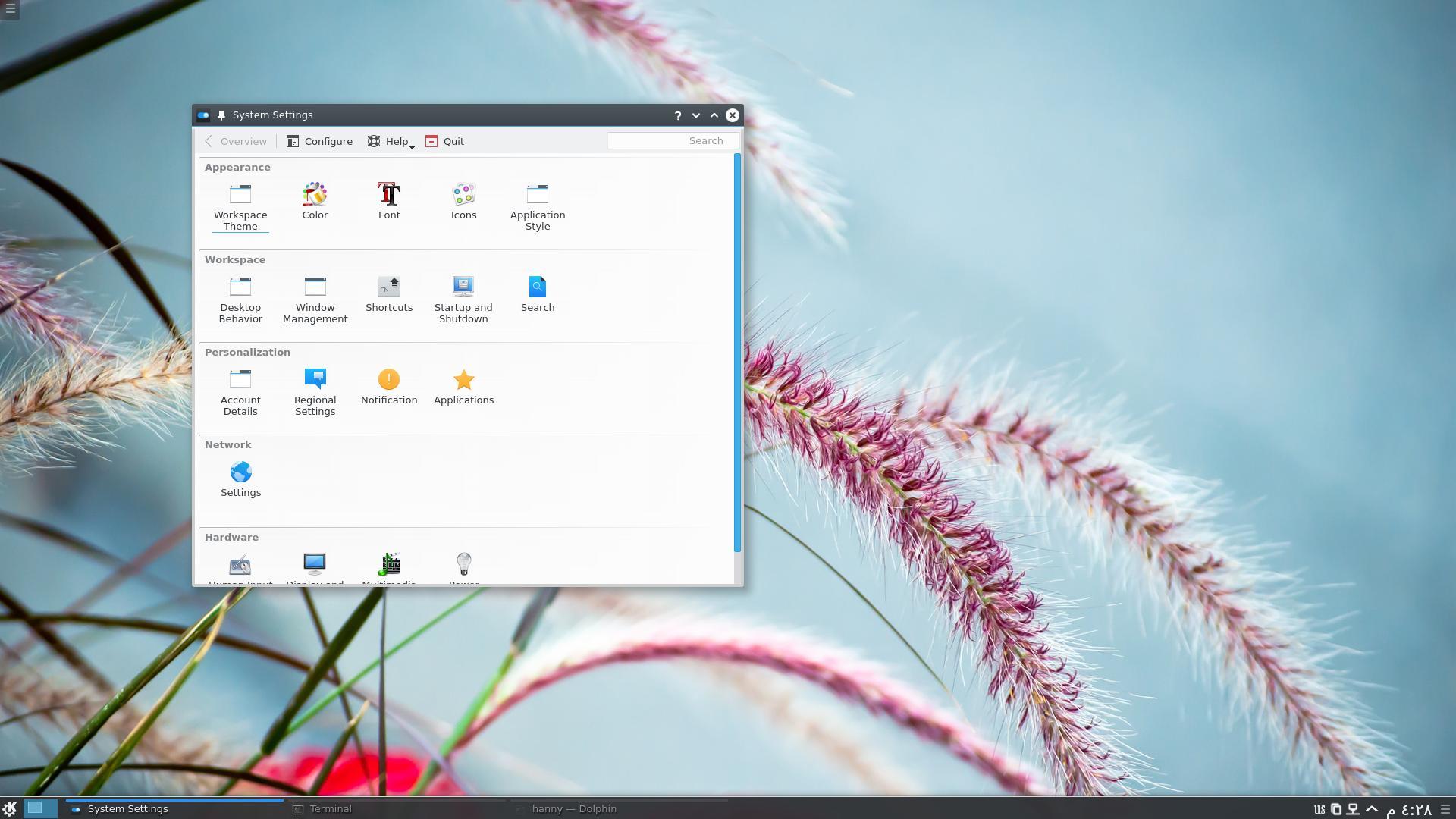
When I upgraded to plasma 5, there were glitches in redrawing the frames on mouse hover. Without googling anything, I went to KDE settings and found a quick fix at just 3-4 clicks distance, I switched from OpenGl to XRender. Things like this are breeze to do in KDE.

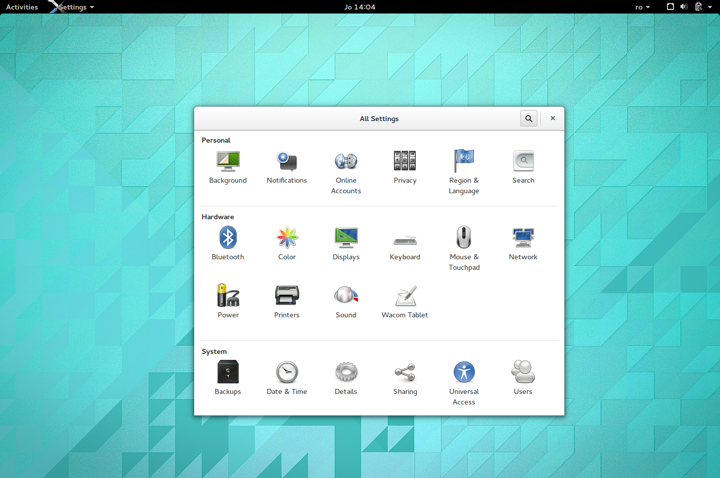
Yesterday, I had to switch OS for something and went for Fedora 21 with GNOME. I faced GNOME after at least a year. Surprisingly, the same redraw glitch appeared. I again went for display related settings, but here there were only crude things, wallpapers, colors etc.

Even though the first face of settings is comparable to KDE's but the depth is where the difference lies.
The ease of modification in KDE (and even Xfce for that matter) is a whole level ahead of GNOME. You might want this or might not, but face it, in a Linux based OS, having more control never hurts. It actually opens way to troubleshooting lots and lots of issues which keep popping up every now and then.
I still feel the fault in design of GNOME is not that they dared to experiment while releasing v3, they simply kept oversimplifying stuff while the control kept lagging behind till the point the users don't feel they have it. Ardent open source fans might hate this, but Windows 8's approach felt much better to me.
There is an art in throwing every possible customization option without scaring the user away. The law of sensible defaults. Windows has been doing this exceptionally beautifully. KDE and Xfce do this equally well.
Its easy to make a command line interface, the symbol of heavy customization potential. Equally easy is to go the other side and make a simple and clean interface with big buttons. But only a few realize that there is not a trade-off here (at least not as much as people think of). Being a huge fan of its UI, I wish GNOME will get over this someday.