Asking myself whats important in the keyboard vs mouse debate. Is it really just the matter of speed or is it more fundamentally connected to what these devices represent? I believe its the cost of attention that matters.
I recently switched to a tiling window manager and gave in some more estate to keyboarding. Not many useful things happen if I click around in my desktop now (unless, of course, there is a browser window open).
Whenever I have to explain someone, who (usually) does not program, why I use keyboard for doing things which are clearly possible using a few mouse clicks, I find myself fishing around for some reasonable transformation of the same old answer, 'using a keyboard is faster'. Do I really care about speed? I would be lying if I said yes to that.
1. Speed vs Effortlessness
There are obvious differences between tasks like writing text vs doing something inherently visual which lets you choose either keyboard or mouse without any doubt. The problem comes with thing like navigating through directory tree, browsing web, reading pdfs etc. You know, questions like whether h-j-k-l is faster than mousing or whether clicking on toolbar is efficient or pressing a shortcut key.
Should you really use keyboard over mouse (or the other way) at these places? Here is Xah Lee talking about talking about this issue, arguing that mouse excels in efficiency at a few places and suggests a hybrid approach instead of being a total keyboard warrior. Here is Jeff Atwood discussing mouse vs keyboard and "advocating a two-fisted computing" approach to improve speed. I mostly agree with their conclusions that these two devices complement each other but there is this little thing, this focus on speed that goes against what I find more important. I am not really, really fast at typing. I can be if I spend some time training myself. But I don't, because typing is now effortless for me. However slow I might be to someone else, I don't even think about improving in that domain (even though that is mostly a low hanging fruit for increasing my overall speed). But I do play around with my other tooling to improve something in my work. What is that something, if not input efficiency?
Rice makes up a major portion of my diet. We have two ways to cook it where I live right now. One is an automatic rice cooker. You put in rice + water and forget it. It automatically gets turned off when done. It takes around 40 minutes. Another way is to use a pressure cooker. Put in rice + water, be attentive for the whistle (so that you could turn the stove off at the correct count) and get cooked rice in less than 10 minutes. We can do some other work in both the cases, but the pressure cooker demands a piece from my bag of attention. We almost never use the pressure cooker for rice (not since our auto cooker broke though).
To clarify, I am not worried about shaving off microseconds but am more inclined to reduce the cognitive burden while doing things which aren't the main focus of the task I am trying to accomplish. I don't avoid something because its slow, but because I don't like doing it.
2. Interface
Good design disappears. Its transparent and doesn't make you sweat for secondary things. In application user interfaces, its the uniformity and familiarity which removes the usage friction. Consider the minimize, maximize and close buttons present in top right of many window managers. Except Mac OS (and few other customized systems), where we get these on the left side, these make up a universal language where you throw your mouse up there and things happen without being overly conscious of the very act of moving the mouse.

Consider something more unorthodox than simply closing the window. How about showing hidden files? Now the uniformity seems to break a little bit. You might have to switch gears and look not on the directly visible controls, but under a certain menu, which might be different in different file managers. This point manifests itself more openly when you push this analogy further to much more a liberal graphical interface, the web. The web is a wild place. There are near infinite design patterns and more keep popping every day. Not that I hate it (I absolutely adore the experimentation possibilities opened up by the web), but this results in you taking more effort to navigate the web instead of focusing on the actual work you want to do.
This breaking point in graphical interfaces becomes important for programmers who are more involved in the act of using a computer than the regulars. They are willing and able to customize their tools for avoiding actions they don't like. The problem is, its hard to make graphical interfaces amenable to extensive customization without making a mess. And if you don't try to do that, you make the next lower level api less accessible psychologically. While using Kwin (KDE's window manager), I was less aware of (and willing to try) its scripting capabilities. What behavior would I possibly alter by scripting my window manager? After switching to StumpWM, I have done a lot of tweaking in how I manage windows, just because now I am closer to the source of the tool itself and thus have a much more elaborate mental model of whats going inside that tool.
Do all these matter for the discussion in hand here? Yes. The mouse and the keyboard are just input methods. They fuse with the interface to become part of it. They neither stand for the interface you are facing, nor are they complete representations of the vices and virtues of these interfaces. Being just a part of the interfaces, the question now is about which interface, as a whole, is better suited for users who can reduce the cognitive friction if provided sufficiently deep access to the innards of the program.
3. Plain text
Take any piece of software apart and you will find code. Text. There is no other popular intermediate representation. And text has a uniform UI. Set of lines arranged in something akin to pages. Every piece of abstraction wraps around this using a set of standards and opinions. If done well, the elements create a very hackable system, which lets you cut off usage strain from most of the places. And its easy to do well at text level because 1) text has a more constrained semantics and 2) it provides a more accurate mental model of the software.
The fact that plain text is the most fundamental UI has a lot to do with why I skip mousing in many situations. This also underlies the subtle difference between how and why an interface accepts keys. Is it for better speed? Or is it for a more fundamental reason like exposing its inner plain text essence? Here is an example. In Gmail's web interface, which I have used pretty often and still do sometimes, I never got to use keyboard shortcuts because both the keyboard and the mouse put me at the same level of control. This changed when I switched to a desktop email client Kmail. I went ahead and added some custom scripts/hooks and boom! I am using keys more. Recently pushed it even further by switching to an Emacs based system mu4e and its all keys now. There lies my argument for saying that keyboarding is superior
Its superior not because its faster, nor because there are shortcuts for you to do things, but because you can make shortcuts to do things.
And this has strong ties with the program itself. What I am proposing, is the idea that keyboards symbolize the act of creating shortcuts rather than using them.
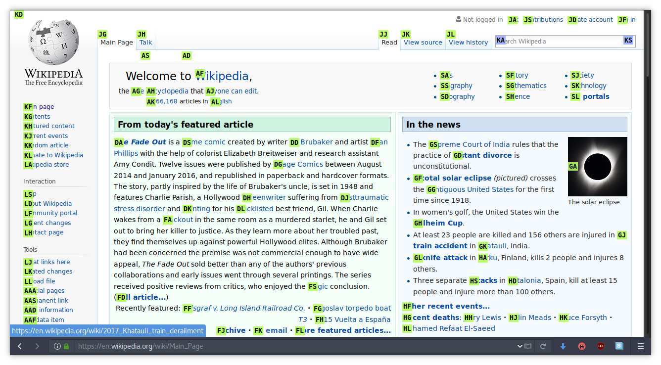
Hint based browsing (like mouseless browsing addon for firefox, see image below) comes to mind as another case here. This lies on the side of an interface which gives you keyboard shortcuts rather than let you create some (unless, of course, you are going to change the addon's source code). Say whatever about efficiency, the interface these hints conjure is at the same level as when you use a mouse. You still have to consciously see where you want to click and then act accordingly.

<a> elements) to click them. The image uses Hok plugin for keysnail in FirefoxWhat would be the keyboard centered interface that I might enjoy more here? Probably something that lets me hit links by allowing me to create a filtering function based on the context. This will take me closer to the page's internal structure and will allow me to avoid effort. From the top of my mind, I will make some filters for navigating search results in any search page (since not all of them let you navigate with arrow keys). And this is possible because I will have access to a more uniform view of the inner dynamics of any page. Arguably, this is not the 'plain text interface' because the user facing side is still the same, but it goes deeper than just setting shortcuts and embraces the ideology of this depth.
Thinking like this, I find it disagreeable now when people talk about learning
keyboard shortcuts and/or improving speed. Consider Emacs. You will find tons of
tutorials which start by telling keyboard shortcuts. For me, while learning
Emacs, the turning point was not when I learned and started using a lot of
keybindings, but when I used helm M-x
and came to know that all these functions (see image below) can be created,
called and bound to keys in whatever way you want.

Keys are not inherently special, the plain text interface is. This also means that at places without a plain text interface, mousing/pointing can be better (like in browsing web). But if you have a keyboard respecting (in the sense that it exposes its inner model instead of just having shortcuts) plain text alternative, that is going to be smoother on mind because of the customization potential created by the similarity of inner and outer representation. And its this smoothness, rather than speed, which really clicks me.